DIAGRAMMING TOOL FOR VISUALLY-IMPAIRED USERS
-
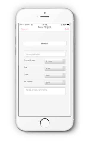
 Create object
 -
 Read all button
 -
 Grid system


PRIMARY POPULATION THE DEVICE IS BEING DEVELOPED FOR:
Visually-impaired users who are comfortable using the iPhone’s VoiceOver feature.
Specifically, we are designing for Chancey Fleet, who works at the NYPL in the Computer Support Clinic. She is an Assistive Technology Coordinator and teaches “Information literacy.” She mostly works with seniors, undocumented New Yorkers, homemakers, and people with disabilities who are trying to go back to work. She works with iPhones & iPads.
PURPOSE OF THE DEVICE
The application will assist visually-impaired (VI) users design the layout of a space (a room, a gallery, a conference center) using a tablet device. For example, a VI event planner will be able to prepare the lay out of an event space with ease, and a VI curator will be able to plan the placements of artworks in a gallery easily.
Our ultimate goal is for the application to be flexible enough to not just be used for spatial design, but to create images, and diagrams.
LITERATURE REVIEW
Presenting UML Software Engineering Diagrams to Blind People
2006, King, Alasdair King; Blenkhorn, Paul; Crombie,David; Dijkstra, Sijo; Evans, Gareth; Wood, John
The TeDUB system promises to deliver a UML diagram tool accessible to blind software engineers. The system uses a number of different interfaces and representation techniques to overcome the challenges of making diagrams created with the Unified Modeling Language usable for blind people. The system is entirely automated and does not require special preparation of UML diagrams by a sighted user. The results of evaluation of the system with thirty-six users were positive. The system was well-received and the participants were able to complete set UML tasks.
The system works by taking the output of UML design tools in a common UML interchange format, XML Metadata Interchange (XMI), and converting and representing the diagram content in a manner suitable for a blind user. The information is displayed in text organized by the hierarchy of the nodes in the diagram — which can be easily read by a computers screen-reader. The below figure is a screen shot of how the diagrams are re-interpreted by the software.

Representing Visual Content for Blind People
King, Alasdair Robin, 2006
The thesis concludes that for web pages and technical diagrams their layout and spatial information need not be re-presented/re-interpreted for blind people. Re-presentation is more successful when it supports user goals and tasks, explicitly communicating to blind people what sighted people can infer from diagrams.
This site describes best practices for accessible web design for visually-impaired users — it includes advice like: avoid pop-up windows, which we discovered through working with Chancey.
Web Content Accessibility Guidelines 2.0
We followed the main principles of the WCAG, which are perceivable, operable, understandable, and robust.

World Wide Web Consortium (W3C), 2008, Web content accessibility guidelines (WCAG) 2.0.http://www.w3.org/TR/2008/REC-WCAG20-20081211/.
PRODUCT REVIEW
Osmo is an educational iOS application. It uses visual recognition to allow a user to manipulate physical objects in space, like blocks with letters, and construct words in physical space, and then within the application.
This table can represent the physical shape of objects using rods on a grid that lift into shapes.
Apps: iOS PhotoShop, iCalendar, Notes, Othello


We took inspiration from a number of mobile apps to design ours, particularly adobe photoshop for iOS, the iOS native apps: iCalendar and Notes, and Othello by Tyflos Accessible Software.
We explored iOS Photoshop because we came to the belief that our user wants an accessible drawing program, and knowing the typical UI for a mobile device will give us a basic design framework. Basically, Photoshop has a large space where a user can create or edit an image, then it has a menu of options at the bottom or top of a screen. We liked the static top/bottom menu locations over pop-up menus because we noticed Chancey had difficulty with pop-up windows. By their nature, pop-up windows are visual and add an unnecessary layer of confusion for a visually-impaired user: since they cover up a small portion of the screen, a visually-impaired user needs to “find” the small pop-up in order to use the features of the pop-up.
Next we took a lot of inspiration from Othello by Tyflos Accessible Software, a company that designed their app to be accessible for visually-impaired users. It has a simple user interface, which we found Chancey was very comfortable maneuvering. In the game, the iOS screen reader announces the name of each square on the game board that a user touches, and announces a bit of information about the square — if the square is empty, if it has a black piece, and if it has a white piece. By using the grid in our program, our user would be able to know where she is spatially at all times, in addition to basic information (where a shape occupies the square or not) as well as a menu of options.
Finally, we took inspiration from iCalendar — another program that uses a grid with information. Using the iOS screen reader, when a user passes over a square, the screen reader tells the user the date, and a small amount of information, like the fact that there are “9 events” on that day. If a user double-taps on that day, then they can find more details on the 9 events, then further down, a user can find out more about a single event (and edit it).
The user screens to edits events inspired all of our menu options.
Finally, we liked the file storage system of iOS Notes, and will use this in the next version to save files.
A user provides a pre-made paper with raised lines, and the tablet “speaks” what the user presses. For example, if you put a raised-line map of the 50 states, a user could click on each state and the tablet would tell you what the state is. This is great for finding information about a graphic, but does not allow for creation of a graphic.
Electrostatic Vibration (formerly “TeslaTouch”)
A new technology for enhancing touch interfaces with tactile sensations. Electrostatic Vibration is based on the electrovibration phenomenon and does not use any moving parts. This technology provides a wide range of tactile sensations to fingers sliding across surfaces of any shape and size, from small mobile displays to curved or wall-sized screens.
While this is an interesting feedback mechanism, it’s not available on the market, requires a specialized expensive hardware, and as far as we know, has little documentation.
This is a braille e-book that turns text from files into braille. It also claims to turn pictures into a tactile display. While this would be able to display tactile graphics, it does not provide a way for a visually-impaired person to create tactile graphics. Chancey wants to create diagrams herself, and she doesn’t want to rely on specialized hardware, like this tablet, which is not even on the market yet.
This is a software that is paired with an embossing printer that enables a user to turn graphics into a tactile product, like an embossed image paper. This tool is not designed for the visually-impaired to create graphics, but for a sighted user to create graphics for a visually-impaired one.
iOS Google Draw and iOS Google Sheets
While somewhat accessible, these did not reliable meet Chancey’s needs. Which Sheets is a grid-based program, and allows for a user to know where they are, as well as add text information into a cell, it requires too many steps to perform actions like creating a shape — and the UI for object creation is difficult for a visually-impaired user to maneuver (selecting the edge of the object in order to resize it, as well as knowing the dimensions of the object.
Using a Kinect to Navigate in Space
We explored this because we were looking for all technology where a visually-impaired person could explore and maneuver in space. While not directly related, it was interesting for us to see strategies and technologies used by visually-impaired people.
Other Applications
Chancey told us about AppleVis , a community of visually-impaired iOS users who rate the usability and accessibility of iOS apps. From here, she pointed out a few more iOS applications to take inspiration from:
- Voice Dream Reader – It packs in a lot of functionality as a reader and a writing program. Chancey used this to get across the idea that as we design, we should not make a “simplified accessible tool”–but one that is powerful and has a lot of functionality. This was an app designed by a sighted person, for sighted people, but the visually-impaired community adopted this because of how accessible it was.
- KNFB Reader: This is an app that lets a user take a picture of text, and transform it into voice-readable audio file. It assists a VI user to take a picture of a document by using the accelerometer and gyroscope to provide vibration feedback to help a user to center a photo of a document.
- TapTapSee: This app tells as user what they took a picture of by using vision recognition algorithms and crowd-sourcing via Amazon Mechanical Turk.
- VO Starter: An app that provides training for those who are new to voice-over — designed for visually-impaired users.
Other Accessible Games for Visually-Impaired Users
Since seeing Othello, we found games to be strong design inspirations because of their fun factor. We speculated that the incentives of games may nudge visually-impaired users to learn challenging UIs. Below are a sampling of games Chancey suggested we explore.
- Wordpopper
- Stem Stumper
- Chess
- (Audio archery, w binaural headset audio)
- Swamp (descriptive gaming).
USER TRIALS
10/10/2015 – Chancey – Initial Meeting
10/16/2015 – Chancey & Chancey’s Comp. Sci Friend – Wireframe
11/17/2015 – User Testing with foam wireframe at DAT Testing Night
11/23/2015 Chancy – Testing
NOTES
Week 10/4
Our team was going back and forth with Chancey to set up our first meeting. We developed questions to ask Chancey to find out her needs and ideal features.
Week 10/11 – Develop Version 1 of Wireframe
This week we met with Chancey twice to get an overview of her needs, Use Case, history with Claire, and design ideas. She spent a good while showing us how she interacted with iOS.

Chancey Meeting 1 (10/10/2015)
How does she typically “diagram” a room or share visual ideas?
- Currently she uses a plastic, heat-sensitive board with a hot pen.
- She currently doesn’t use Claire’s tool, because it was a prototype.
What activity is she trying to do? (Use Cases & Requirements)
- A software that would make it possible for visually-impaired students to “visually” solve LSATs problems with tables or charts.
- A software that would make it possible for visually-impaired people to design a room interior, and, further down the line, a floor plan design.
- A software that would make it possible for visually-impaired people to create all manner of images, like in Adobe Illustrator
- A software that would make it possible for visually-impaired people to use PowerPoint and KeyNote type applications.
- A software that would make it possible for visually-impaired people to share visual ideas, in the way a team with an easel could.
Requirements
- Voice Screen readers don’t tell you what something “looks like.”
- For whatever software we develop, she wants finer-grain features to be called by demand with a double-press.
- She wants to have a tool that works on a tablet, because you don’t need to have new special hardware, and it’s available to many people.
- If you’re working with something spatial, say what’s highlighted, what’s colored — by adding sound to the space.
- Be able to make a shape and then attribute qualities to it. For example, to attribute color to a shape, and then the color is represented by sound. Chancey can currently maneuver through space by recognizing a vocabulary of sound. For example, she can read websites by knowing:
- Hyperlinks on website “beep”
- Headings have “tones” associated with them.
- She dislikes the use of tactile feedback, like vibrations. For a blind user, she feels these are too invasive.
- She would like programmed pre-set patterns, e.g. a Venn diagram, that would allow for permissible overlap.
- She would like a drag and drop experience.
- Like Othello, she would like a grid in the background, where each square is labeled with a letter and a number.
- Does not want Voice Recognition — because in her experience, she has (and the community of visually-impaired users) have not found it reliable.
- Output to embossing printer (not a priority, but in the future)
- She would like the tool to be powerful enough that a sighted person could use it too.

Chancey Meeting 2
We met with Chancey again this week and showed her our first Wireframe. She brought her friend, J.J. a visually-impaired computer science student.

https://gomockingbird.com/mockingbird/#73y6js0/RoXTE8
Below is the feedback we received from Chancy and J.J. on the wireframe we developed, based on her requirements.
First page – edit/create shape:
- instead of “connections” call it “tags”. This is a way to filter/organize by related tag groups later on.
- figure out how text is being input
- Consider adding automatic relations to the shape (up, right, left ,down empty/full)
Second page – Work space:
- Add staging area as a button (not its own page) that will open a vertical side screen with shapes ready to be dragged in
- Have the program provide a warning/feedback for overlapping
- Consider a “how many” button, that summarizes how many objects are on the screen.
Third page – Results:
- She does not want a sound when there is no object.
- We should leverage Voice Over to read all text and menus (so build software so it’s VoiceOver legible.)
- Consider a grid to snap on to and to use a coordination (x ,y or H12) how would zoom work here?
Week 10/18
After meeting with Chancey and J.J., our group met to discuss and process their feedback. While the initial use case was for designing a room, Chancey articulated that she wanted to create a powerful program for creating many types of diagrams, and for precisely designing spaces. She didn’t want a program that would have functionality merely for “sketches.” With our limited time in mind, we began thinking of ways to design an application that would allow for programers to continue to add features.
Over the past few weeks, the biggest discovery for us was how versatile and useful iOS VoiceOver was, prompting us to practice using VoiceOver ourselves. One of our group members did the long Mac tutorial and found it *was not* helpful for this project, so feel free to skip this, but learning iOS VoiceOver is critical.
Her ability to play Othello with VoiceOver was particularly interesting to us — because it showed us a UI she was comfortable using to maneuver in space: a Grid!

Video of: Using Accessible Othello
Week 10/25
This week our DAT class visited CUNY Baruch College’s Computer Center for Visually-Impaired People (CCVIP) (https://www.baruch.cuny.edu/ccvip/) and got deeper into using accessibility features for visually-impaired users, like JAWs. Getting practice with JAWs and hearing classmates’ comments on the aural UI was helpful as we continued to develop our second wireframe.
We kept thinking of all the ways to incorporate Chancey’s feedback.

Week 11/1
This week we summarized our work for our midterm presentation, which we presented 11/3.
Week 11/8
Our group met to finalize our second wireframe. We incorporated the feedback we received, and fully re-designed the app to focus on the grid UI. We also were sure to design the app so that text would be prominent and easy to find — thereby reducing the emphasis on complex UX features, like the use of pop-up windows, since Chancey found it difficult to use pop-ups (since she couldn’t tell when they actually popped-up).
A feature of this design was to only allow to a user to put an object inside of a grid square.


Week 11/15 – User Testing in DAT Class
On user testing night we were able to practice our pitch. Both sighted and visually-impaired users had difficultly understanding what we were trying to do, and why — and we were able to develop language, with examples, to explain what we’re doing.
With help from Anthony Ptak (a visually-impaired ITP grad, who was helpful and generous with his feedback), we came up with this:
Creating a product for spatial designers who are visually- impaired.
We user tested on two-fronts. 1. We were able to get Claire’s original project working on a tablet using Phone-Gap, and test it, as well as to create a physical prototype One challenge was that our users were not visually-impaired, and we had to explain VoiceOver.

Week 11/22 – Developing Application
Chancey Meeting 3
This week we met with Chancey to go over our Wireframe which worked with Voice Over. We were able to explain our features and functionality, as she went through our application. Since it was difficult to design with all of Chancey’s desired features in mind, we hewed close to the original Use Case — of designing the space in a room. In our next iteration, we will make the application more powerful. Since we took inspiration from iCalendar, she showed us how she used and maneuver it. We also pull javascript calendars from github to show Chancey as a potential UI.
See the video here:
While we were glad that the Wireframing program interacted with VoiceOver, it was not perfect. There were invisible squares that were being “read” by VoiceOver — a few other negative factors. However, after doing an extensive search of accessible wireframing programs, we found that they were all about the same — the one we were using, for the price, was fine. Instead of a wireframe, at this point we would need to actually develop the program itself.
Over the past few weeks, Paul has been diving into the code of Claire’s old application to figure out how it works. Paul and Oryan met with Shawn van Every who worked with Claire on the original application to get an overview and walkthrough of the code. They began trying to re-use and re-configure the old code to fit our wireframe, since it had a built-out back-end for creating and saving files.
Week 11/29
This week we continued to meet on the weekend to move forward with the code. It’s been time-consuming to develop on top of the old code. We met with Luke duBois in class to review the progress of our project — and to brainstorm solutions to UI issues.
This led us to consolidate a few features in our app, and rethink the UI. We developed a more elegant, powerful wireframe.

Week 12/7
This week we continued to meet on the weekend to move forward with the code. It’s been time-consuming to develop on top of the old code — but we have a better handle of it. We have not been able to show Chancey a working example of our project, but we are working towards a working prototype.
